Solar Path Lights Design and Inspiration is where most yards either look intentionally “done”… or accidentally chaotic. Here’s the fast way to get it right: pick one lighting “job” per zone (guidance, mood, or feature), keep spacing consistent, and match color temperature across the whole visible area. Do that and you’ll instantly stop the “random dots of light” effect that screams cheap.
Before you buy anything, walk your path at night with your phone flashlight aimed at the ground (not ahead). Notice where your feet actually need light: step-downs, turns, uneven pavers, and the first 10 feet from your door. That’s your “must-light” map. Everything else is optional and should serve style, not safety theater.
Table of Contents
- Design Goals Before You Buy
- The Three-Layer Lighting Plan
- Layout Rules That Make Any Yard Look Designed
- Spacing, Height, and Beam Control: The Real Math
- Choose a Style Language: Modern, Rustic, Classic, or Playful
- Color Temperature and Finish: How to Avoid Mismatched Glow
- Inspiration by Zone: Front Walk, Driveway, Garden, and Backyard
- Feature Lighting with Solar Path Lights (Yes, You Can)
- Seasonal and Holiday Setups Without Looking Tacky
- Common Mistakes That Ruin the Look
- Installation Details That Separate Pro from DIY
- Maintenance and Refresh: How to Keep the Design Looking New
- FAQ
- Resources / Tools
Design Goals Before You Buy
Most people start with product shopping. That’s backwards. Start with the visual goal, because lighting is a layout problem first and a hardware problem second.
Pick your primary outcome
Solar path lights do three jobs. Decide which one is the “boss” in your space:
- Guidance: safe movement along paths, steps, and transitions.
- Mood: a soft perimeter glow that makes the yard feel finished from the street or patio.
- Feature: pulling attention toward a focal point (a planter, a small tree, a sculpture, a house number, a seating nook).
If you try to make every light do all three, you get the classic “airport runway” look: bright dots, harsh glare, and no focal story.
Decide what the lights should not do
Good design is mostly subtraction. For path lighting, your “no list” should include:
- No glare in sightlines: if you can see the LED source from standing height, it’s going to feel cheap and annoying.
- No uneven spacing: irregular gaps look like you ran out of lights (even if you didn’t).
- No mixed color temperatures: cool white next to warm white is the fastest way to make a nice yard look accidental.
- No light pollution blast: upward spill is a vibe-killer and can upset neighbors. Dark-sky-friendly thinking is good taste. For reference on responsible outdoor lighting, see the guidance from DarkSky.
Make a quick night map
Do this once and you’ll save money and frustration:
- Stand at your door at night and look outward. Mark where your eyes naturally go.
- Walk the path. Mark “risk points” (steps, slopes, corners, loose gravel, uneven joints).
- Mark “beauty points” (a plant group, a texture wall, a feature pot, a mailbox, a house number).
You now have a simple plan: risk points get guidance lighting, beauty points get feature-ish lighting, and everything else gets mood if budget allows.
If you want to turn that into a full site-wide aesthetic system later, build a consistent category approach and linking structure from the start. A good next step is creating a strong hub page and internal paths like solar path light layout ideas for walkways so readers can move from inspiration to buying decisions without bouncing.
The Three-Layer Lighting Plan
Pros don’t “place lights.” They build layers. You can do the same with solar, even if your fixtures are simpler than wired systems.
Layer 1: Guidance
This is functional light aimed at the ground where feet go. Not bright. Not tall. Not flashy. It should be quietly helpful.
- Best placement: near step-downs, turns, and edges where the path disappears.
- Best look: shielded light, low glare, consistent rhythm.
Layer 2: Perimeter mood
This is where design lives. It frames the space the way trim frames a window. Think of it as the “soft outline” that makes the yard feel expensive.
- Best placement: outer edges of a walkway, along a garden border, or gently defining a patio boundary.
- Best look: fewer lights than you think, evenly spaced, matched finishes.
Layer 3: Feature moments
Solar path lights can create feature moments by controlling contrast. Not by blasting brightness. Use proximity, spacing changes, and intentional clusters (done carefully).
- Best placement: a focal planter, a bench nook, a statement tree, a sculptural rock, or the last curve before a front door.
- Best look: a small “tightened rhythm” leading into the focal point.
Insider Tip: When you want something to feel “designed,” create one deliberate pattern break. Keep most spacing consistent, then slightly tighten spacing for 6–10 feet near the feature. It reads as intentional emphasis, not randomness.
Layout Rules That Make Any Yard Look Designed
Design isn’t about having the fanciest lights. It’s about not making the viewer’s brain work too hard. Here are the rules that consistently deliver a “clean” result.
Rule 1: Build a rhythm, not a scatter
Pick a spacing unit and stick to it. Humans love patterns. When spacing feels predictable, the whole yard feels calmer and higher-end.
- Simple rhythm: equal distance the whole way.
- Tiered rhythm: slightly tighter spacing near steps/turns, then return to normal.
Rule 2: Symmetry is optional; consistency is not
Perfect left-right symmetry works in formal landscapes and straight walkways. But most homes have curves, plant beds, and imperfect geometry. You don’t need symmetry. You need consistent logic.
Example: “Lights always go on the inside of curves” is a consistent logic. “Lights randomly swap sides” looks like an accident.
Rule 3: Hide the source, show the effect
If the LED is visible at eye level, you’ll get glare and that “cheap dot” vibe. Choose fixtures with a cap, louvers, or frosted diffusion. For deeper reading on lighting comfort and distribution concepts, the Illuminating Engineering Society (IES) is a credible reference point.
Rule 4: Use negative space on purpose
Not every foot needs a light. Dark areas create contrast, which makes lit areas look better. Over-lighting flattens everything and kills mood.

Spacing, Height, and Beam Control: The Real Math
You don’t need a photometrics lab. You need three practical rules and one reality check about solar performance.
A practical spacing guide
Spacing depends on brightness, beam spread, and mounting height. But these ranges work in real yards:
- Low, soft lights: 6–10 feet apart (best for mood and subtle guidance).
- Mid-bright lights with good diffusion: 8–14 feet apart (best for longer paths).
- High-glare “spotty” lights: they look worse the closer they are; if you must use them, space them wider and aim the glare away from sightlines.
Height doesn’t mean better
Taller fixtures can throw light farther, but they also expose the light source to your eyes. In most residential paths, mid-low height reads cleaner and feels more intimate.
Beam control is why some lights look “expensive”
The expensive-looking setups aren’t necessarily brighter. They’re controlled. Look for:
- Downward shielding: a cap that blocks direct view of the LED.
- Diffusers: frosted lenses that soften the pool of light.
- Defined pools: light that lands on the ground, not in your eyes.
Solar reality check: sun exposure runs the show
Solar lights are only as good as their daily charge. If your path is shaded by trees or your house, design around that truth:
- Use fewer lights and place them where they get the best sun exposure.
- Reserve “high-demand” spots (like brighter guidance near steps) for the sunniest locations.
- Consider separating “design lights” from “safety lights” (solar for mood/perimeter, and a couple motion fixtures near doors).
If you want a baseline on how solar technologies work and why sunlight matters, the U.S. Department of Energy’s overview of solar energy is a solid starting point: DOE: Solar Energy Basics.
Choose a Style Language: Modern, Rustic, Classic, or Playful
Here’s a design truth: one cohesive style beats five “pretty” fixtures fighting each other. Pick a style language and enforce it.
Modern minimal
Look: clean lines, matte finishes, simple geometry.
Placement strategy: disciplined spacing, fewer fixtures, stronger rhythm.
Best pairing: straight or gently curved paths, contemporary facades, gravel borders, architectural plants.
Classic traditional
Look: lantern-inspired tops, warm glow, softer silhouettes.
Placement strategy: symmetric or near-symmetric placement feels natural here.
Best pairing: brick, traditional landscaping, cottage gardens, warm-toned stone.
Rustic / farmhouse
Look: black, bronze, weathered textures, sometimes with seeded glass.
Placement strategy: slightly imperfect (but consistent) placement can feel authentic.
Best pairing: wood elements, natural stone, mixed plantings, informal borders.
Playful / decorative
Look: string-like effects, patterned cast light, color accents (used carefully).
Placement strategy: keep playful lighting contained to one zone so it doesn’t hijack the whole yard.
Best pairing: back patios, entertaining corners, seasonal setups.
Insider Tip: If you’re unsure, default to “quiet modern.” Neutral finishes and warm-white light work with almost every house. Decorative patterns are fun, but they lock you into a look fast—and they age faster than you think.
Color Temperature and Finish: How to Avoid Mismatched Glow
This is where most DIY installs get exposed. Mismatched glow looks sloppy, even if the fixtures are nice.
Pick one color temperature per visible scene
As a general rule:
- Warm white (roughly 2700K–3000K): cozy, upscale, forgiving on plants and stone, best for most homes.
- Neutral white (around 3500K): cleaner and slightly crisper, can look modern if everything else matches.
- Cool white (4000K+): often harsh outdoors unless the house design is very contemporary and the whole scheme is consistent.
If you want to align with widely accepted lighting comfort principles, follow the “less glare, warmer tone, targeted light” philosophy promoted by dark-sky advocates like DarkSky.
Finishes should match the house hardware
Quick cheat codes that work:
- Black fixtures pair well with black window trim, modern doors, and contemporary railings.
- Bronze works with warm stone, traditional brick, and mature landscaping.
- Stainless/steel finishes can look sharp, but they show fingerprints and can reflect glare—use carefully.
Avoid the mixed-metal mess
Mixed metals can work, but only when it’s obviously intentional and repeated. If your door hardware is black and your fixtures are silver and your mailbox is bronze, the yard reads as “assembled,” not designed.
Want a clean approach that supports long-term SEO content structure too? Build a repeatable design framework readers can apply, then branch into deeper posts (spacing, styles, best products). That’s why pillars like this should connect into targeted sub-guides such as how to choose solar path lights that match your home—same topic ecosystem, different decision stage.
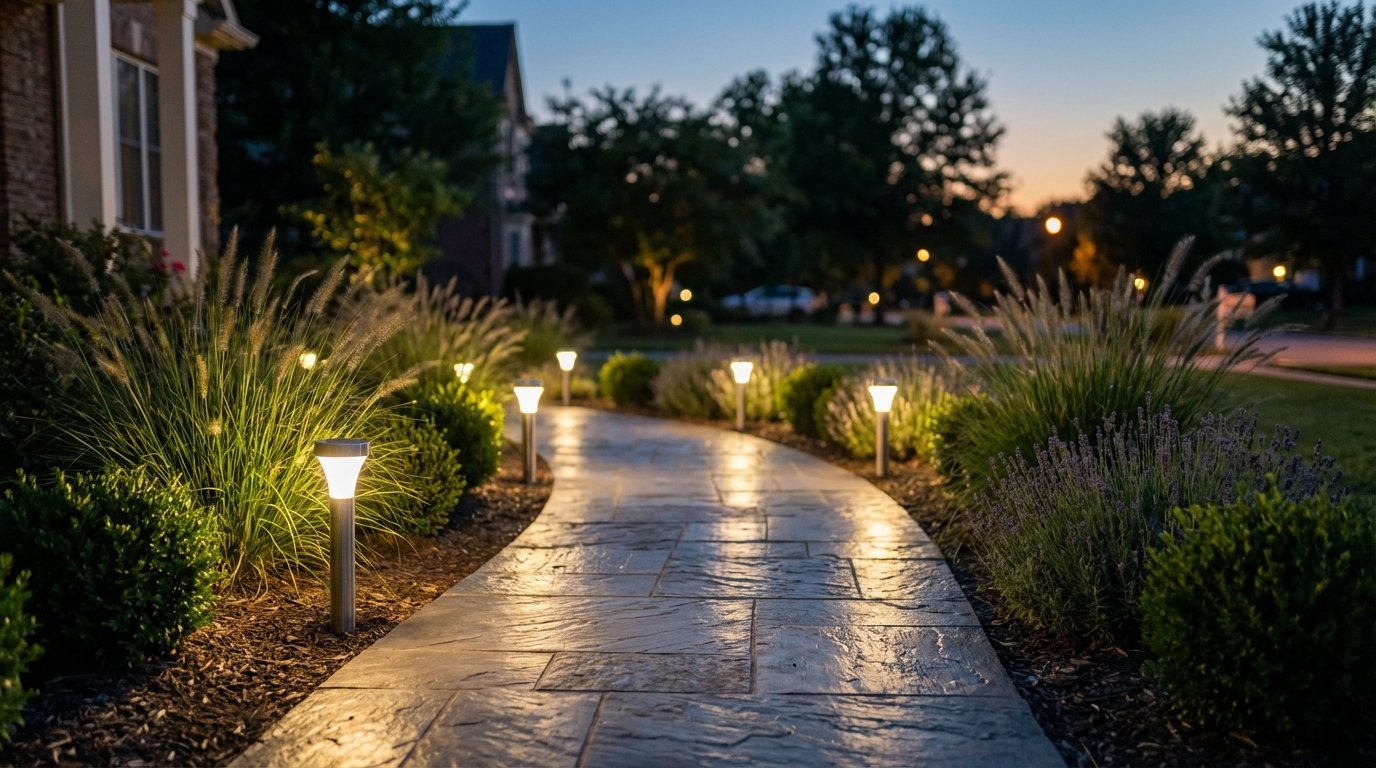
Inspiration by Zone: Front Walk, Driveway, Garden, and Backyard
Different zones need different lighting logic. Here are proven setups that look intentional and photograph well (which matters if you ever sell the home—or just want it to look great from the street).
Front walkway: the “welcome run”
Goal: guide guests comfortably and make the entry feel inviting.
Layout: start the first light close to the entry point (near the sidewalk or driveway), then repeat spacing until the door. Tighten spacing slightly for the last 6–10 feet near the porch to create a “pull-in” effect.
Style: match the house hardware and porch light finish. The path lights should look like they belong to the same family.
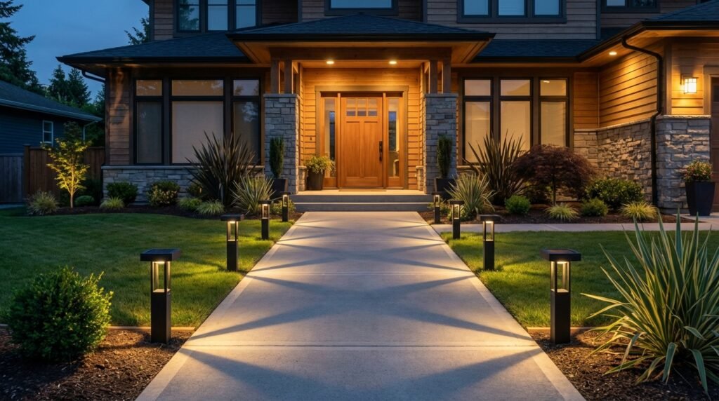
Driveway edge: soft definition
Goal: define edges without turning your driveway into a runway.
Layout: place lights on the landscaping side, not in the tire path. Use wider spacing than a walkway. Let the driveway itself stay darker; your eye should go toward the home, not the pavement.
Tradeoff: too many lights here looks aggressive and can annoy neighbors. Less is more.
Garden beds: quiet frame
Goal: outline bed shapes and create depth.
Layout: keep lights just inside the bed edge, angled (or positioned) to wash the border area rather than pointing outward.
Pro move: group plants in threes (visually), then place a light near the group rather than evenly spacing lights like fence posts.
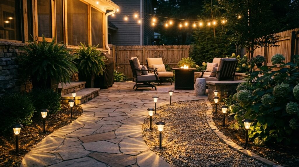
Backyard paths and patio perimeter
Goal: mood and usability—enough light to move around, not so much that it kills the atmosphere.
Layout: perimeter lighting works great here. Outline the patio edge with subtle pools of warm light. Keep the center darker so the space feels relaxed.
Best pairing: add one or two warmer “anchor” fixtures (like lantern-style solar lights) near seating to create a cozy focal zone.
Side yard: the forgotten zone
Goal: safety, not showmanship.
Layout: fewer fixtures, placed only where needed—gate, trash bins, steps. Side yards are where solar struggles (shade), so don’t over-invest.
Feature Lighting with Solar Path Lights (Yes, You Can)
Solar path lights aren’t spotlights. But you can still create feature moments by controlling attention using contrast, clustering, and reflective surfaces.
Use clusters to create a “feature node”
Instead of spreading lights everywhere, build a small cluster near a focal element:
- Two lights closer together framing a planter.
- Three lights in a gentle arc around a small tree bed (not a tight circle).
- A short “double-run” on both sides of a path for 6–8 feet near the entry.
The key is restraint: keep clusters rare so they feel special.
Use reflective materials for “free” drama
Light looks better when it has something to play on. If you want a higher-end look without more fixtures:
- Add light-colored gravel strips beside the path.
- Use textured pavers that catch highlights.
- Place a pale stone or ceramic pot where you want attention.
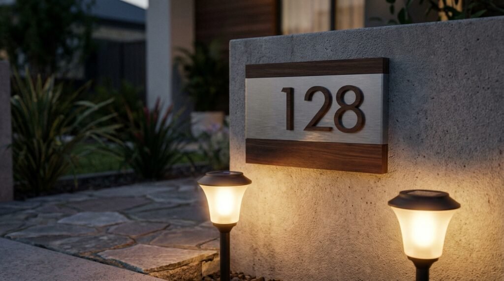
Highlight house numbers and mailboxes
Instead of trying to blast your whole front yard, make one thing easy to see. You can place two path lights slightly forward of the numbers or mailbox so the reflected glow improves readability without glare.
For broader guidance on efficient lighting and avoiding wasted output, ENERGY STAR’s lighting resources can be useful context: ENERGY STAR: Lighting & Fans.
Seasonal and Holiday Setups Without Looking Tacky
Seasonal lighting gets messy when it’s layered on top of an already busy base. The solution: keep your “core” path lighting neutral and timeless, then add seasonal accents in contained zones.
The core-and-accent rule
- Core: warm-white path lights in consistent spacing, all season.
- Accents: seasonal color or decorative patterns limited to one area (entry planter, porch steps, backyard seating).
Fall and winter
Warm-white is your best friend. If you add color, keep it deep and restrained (amber tones feel better than harsh rainbow effects). If you use stake lights with decorative cutouts, place them where the pattern hits a surface (a wall, a fence, a path), otherwise the “pattern” disappears.
Spring and summer
This is where subtle wins. Let plants be the hero. Use lights to outline paths and beds, and keep the temperature warm so greenery looks healthy instead of gray-green.
Don’t forget the neighbors and the night sky
Glare and blue-heavy light can be intrusive. If you care about being a good neighbor (and having taste), the principles promoted by DarkSky are worth following: shielded, targeted, warm light, used only where needed.
Common Mistakes That Ruin the Look
This section is the “save your money” part. These mistakes are why people end up with a yard full of lights and still don’t like how it looks.
Mistake #1: Too many lights everywhere
Over-lighting flattens your yard. It removes contrast. It also highlights every imperfect edge and uneven surface. Use fewer lights, spaced with intention, and you’ll get a cleaner aesthetic.
Mistake #2: Mixing color temperatures
Warm-white next to cool-white looks like you bought replacements from a different brand mid-project. Pick one temperature for the whole visible scene.
Mistake #3: Glare in eye lines
If the LED is visible from standing height, the light will feel harsh. Use shielded caps or frosted lenses. A calm yard is almost always a low-glare yard.
Mistake #4: Placing lights like fence posts
Even spacing can be good, but only when it follows path logic. When you place lights around random edges and corners with equal spacing, it looks like a perimeter alarm system.
Mistake #5: Ignoring solar charging realities
Shaded areas will underperform. Design with sun exposure in mind. If you need the side yard lit reliably, don’t pretend solar will behave like wired lighting.
Insider Tip: If a shaded section is unavoidable, don’t “add more lights” there. That just gives you a dimmer, messier look. Instead, reduce fixtures in shade, and visually balance the scene by placing slightly stronger lights in sunnier segments. Your eyes read the whole composition, not a spreadsheet of equal counts.
Installation Details That Separate Pro from DIY
Even good fixtures can look bad if they’re installed sloppy. Here’s how to get a crisp, intentional finish.
Set a straight line with a guide
For straight paths, use a string line or even a garden hose stretched straight as a visual reference. The goal isn’t perfection; it’s avoiding the “drunk zig-zag” pattern that happens when you eyeball it.
Match height and depth
Path lights look cleaner when the tops align. If the ground undulates, install slightly deeper or add compacted base material so the caps sit at a consistent height.
Stabilize in loose soil
Loose soil makes lights lean over time. A practical fix:
- Compact the soil where each stake goes.
- Add a small amount of gravel at the base for drainage and stability.
- Check alignment after the first rain and adjust once.
Avoid direct sprinkler hit
Constant sprinkler spray accelerates clouding, corrosion, and water ingress—especially in cheaper fixtures. If sprinklers must hit the area, choose sturdier lights and plan for more frequent maintenance.
Think like a photographer
Most people see your yard from two angles: the street and the patio/doorway. After installation, stand in both places and look for:
- Visible glare points
- Odd gaps
- Uneven heights
- One overly bright “hot spot” that dominates
Fixing these takes minutes and makes the design feel intentional.

Safety and certifications: don’t ignore them
Even though these are low-voltage solar products, build quality matters. Look for clear durability claims (weather resistance) and reputable safety testing when available. For context on product safety standards and testing, you can reference organizations like UL Solutions.
Maintenance and Refresh: How to Keep the Design Looking New
Outdoor lighting gets dusty, tilted, and “tired.” The good news: small maintenance moves keep your design looking sharp without replacing everything.
The 5-minute monthly reset
- Wipe the solar panels with a damp microfiber cloth.
- Wipe lenses/diffusers (dust kills brightness and makes light scatter ugly).
- Re-straighten any leaning fixtures.
Seasonal refresh (2 times a year)
- Pull lights, rinse off mud, and inspect for water intrusion.
- Trim plants that started blocking solar panels.
- Re-evaluate spacing: plant growth changes the visual balance.
When to replace vs. reposition
Don’t assume dim output means the light is “bad.” Common causes:
- Solar panel is shaded by new growth.
- Lens is cloudy or dirty.
- The fixture is tilted and throwing light the wrong direction.
If you fix those and it’s still weak, then replace—preferably within the same design family so your scene stays cohesive.
Design refresh without buying new lights
Want the yard to feel “new” without spending? Try one of these:
- Re-center your rhythm: shift the entire run so the first and last light placements feel balanced.
- Create one feature node: tighten spacing near a planter or entry step.
- Reduce by subtraction: remove every third light on a long run if it feels too busy.
For general consumer guidance on choosing efficient products and thinking about performance claims, resources from government-backed agencies like the U.S. Department of Energy can help you keep your expectations realistic.
If you’re planning to expand into deeper product comparisons and performance breakdowns, build that content cluster intentionally so readers can move from design inspiration to buying confidence. A tight next step is a dedicated roundup like best solar path lights for curb appeal that connects style outcomes to product selection.
FAQ
How many solar path lights do I need?
Count the “must-light” points first (steps, turns, hazards), then fill the remaining run with consistent spacing. Most walkways look best with fewer lights than people assume—often 6–12 for a typical front path, depending on length and brightness.
What spacing looks best?
For a clean residential look, start around 8–12 feet and adjust. Tighten spacing near steps and turns. If the lights create harsh dots, increase spacing or switch to a more diffused fixture.
Should lights go on one side or both sides?
One side can look modern and minimal on narrower paths. Both sides feels more formal and “grand.” The wrong move is switching sides randomly—pick a logic and stick to it.
Warm white or cool white?
Warm white is the safe bet outdoors. It looks better on stone, plants, and most house exteriors. Cool white can look harsh unless the whole design is modern and consistent.
Why are my solar lights dim?
The usual suspects: dirty panels, shaded placement, cloudy lenses, or old rechargeable batteries. Clean and reposition before you replace.
Do solar path lights work in shade?
They can, but performance often drops hard. If the location gets limited direct sun, use fewer lights and place them where they get the best exposure, or consider alternative lighting for that zone.
How do I avoid glare?
Use shielded caps or diffusers and keep lights lower. If you can see the LED source from standing height, you’ll likely get glare. Reposition or swap fixtures.
Can I mix different styles of fixtures?
You can, but it’s risky. If you mix, repeat the mix intentionally (same finishes, same color temperature) and keep it limited to one zone. Otherwise the yard looks “assembled.”
How long do solar path lights last?
Quality varies. The LEDs can last a long time, but panels and batteries are the usual failure points. Expect to refresh batteries or replace units over the years, especially in harsh weather.
What makes a yard look professionally lit?
Consistent rhythm, low glare, matched color temperature, and intentional emphasis near focal points. The “pro look” is almost never about maximum brightness.
Resources / Tools
These are practical Amazon search links for products that help you execute better layouts, cleaner installs, and more durable results. Each link is a search (not a direct product link), so you can compare options and pricing.
- Solar path lights (warm white, shielded cap) Helps you get a calm, upscale glow with less glare and more consistent pools of light. Best for: front walkways and curb appeal layouts. Shop on Amazon
- Solar path lights (black modern minimalist) Clean geometry and neutral finishes that match modern doors, windows, and railings. Best for: contemporary homes and simple spacing rhythms. Shop on Amazon
- Solar path lights (bronze traditional lantern style) Classic silhouettes that look right with brick, warm stone, and traditional landscaping. Best for: cottage and traditional front yards. Shop on Amazon
- Rechargeable AA/AAA batteries for solar lights (NiMH) A simple battery refresh can restore brightness and runtime without replacing fixtures. Best for: maintaining older solar lights that still look good. Shop on Amazon
- Microfiber cloths (panel and lens cleaning) Cleaning panels and lenses improves charging and reduces ugly scatter and dimness. Best for: monthly maintenance and quick “like new” resets. Shop on Amazon
- Landscape edging (to create clean borders) Sharp edges make lighting look more intentional because the layout has a clear frame. Best for: garden bed outlines and walkway borders. Shop on Amazon
- Crushed stone or pea gravel (for stable bases) Helps prevent leaning fixtures and improves drainage in loose soil. Best for: long runs where you want consistent height. Shop on Amazon
- String line and stakes (alignment tool) Keeps installs straight and professional-looking without overthinking it. Best for: straight paths and driveway edges. Shop on Amazon
- Outdoor-rated silicone sealant Useful for minor weatherproofing touch-ups on budget fixtures (when appropriate). Best for: extending life in wet climates and sprinkler zones. Shop on Amazon
- Garden spade or bulb planter tool Makes cleaner holes and reduces turf damage when installing multiple lights. Best for: fast installs and neat results. Shop on Amazon
As an Amazon Associate I earn from qualifying purchases.